
Why do "daytime hours only" plots have aliased top/bottom edges?
Last modified:
If you selected "Daytime hours only" when analyzing or comparing airports, you might notice how top and/or bottom edges of certain plots have vastly different colors/values. Why?
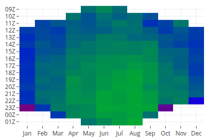
Note the bottom "pixel" for Jan, Feb, Mar, Sep, Oct, and Dec don't really match the color trend above.
Since sunrise and sunset times change throughout the year, there aren't 31 days' worth of sunsets represented in the bottom January pixel. Since only a subset of each month is represented in the bottom pixel, that pixel is subject to bias from either the first or last part of the month (depending on the season).
For Pro customers, this bias isn't visible in 24-hour plots.